My First Notes
August 25, 2024 in Development, Showcase13 minutes
This is the second post in a series documenting my progress on the Graph Notes project.
I’ve learned over the course of my career that, when dreaming big, you have to think small. By this, what I mean is that making something ambitious, like the world’s most powerful note-taking app, is accomplished by taking iterative steps. Today’s baby step will be the introduction of some rudimentary notes.
Just a single note
That’s it. We can hang our hat up after tracking a simple blurb of text.
No, seriously, we really are starting that small. I think you’ll find, though, as we accomplish this seemingly basic feat, that we’re forced to do some big things along the way.
For starters, let’s revisit our interface. We left off with a skeletal app in the last article,
and we’ll be building on that foundation in today’s work. Let’s hunt down src/app.rs and make some tweaks to
capture some text. In particular, I’ll revisit the update function as follows:
    fn update(&mut self, ctx: &Context, frame: &mut Frame) {
        egui::CentralPanel::default().show(ctx, |ui| {
            let mut text = String::new();
            ui.label("Note text");

            egui::TextEdit::multiline(&mut text).show(ui);
        });
    }
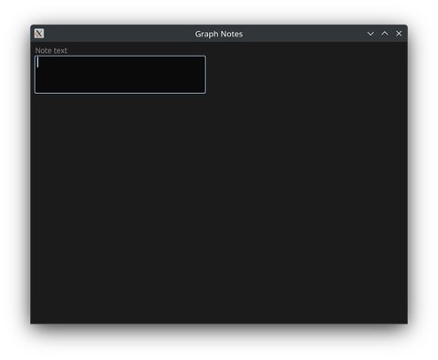
Kinda ugly, if you ask me; also, if you try to type into that text area, you should quickly realize that it doesn’t actually let you type into it (or, rather, the text vanishes almost as soon as you enter it) - this is because our state doesn’t have a good place to live, and is recreated with every frame that’s rendered. No es bueno.
We’ll deal with aesthetics later; for now, it would be better if our app actually did the thing it is supposed to. For now,
thinking about where we’re at (inside the App instance), and the fact that we’re dealing with a &mut self in our update
function, it stands to reason that gives us the best place to put data. In fact, if you might recall, our App doesn’t currently
hold any data:
pub struct App;That seems like a good therapeutic target. Let’s add some data to this structure to let us represent our note:
pub struct App {
    note: String,
}
… and alter our update function to use it instead of our ephemeral state:
    fn update(&mut self, ctx: &Context, frame: &mut Frame) {
        egui::CentralPanel::default().show(ctx, |ui| {
            ui.label("Note text");

            egui::TextEdit::multiline(&mut self.note).show(ui);
        });
    }
If you try to run this now, you’ll also find an angry compiler that wants you to revisit the default implementation:
impl Default for App {
    fn default() -> Self {
        Self {
            note: String::new()
        }
    }
}
With that, you should now be able to enter text into the form field, and see it stick. You can find the commit for the above changes here to see before vs. after.
A little bit more - more notes, more data
That note’s pretty useless by itself. Maybe there’s a use-case for a program that lets you just type some stuff into a box, but our notes are fancier than that. At a minimum, we’ll want to know when the note was created, a title to go along with it, and I’m guessing we’ll want more than one single note in our lonely application.
First, let’s build out a separate struct to handle our note’s structure, along with a constructor:
use std::time::SystemTime;

// ...

struct Note {
    created_on: SystemTime,
    title: String,
    text: String,
}

impl Note {
    pub fn new() -> Self {
        Note {
            created_on: SystemTime::now(),
            title: String::new(),
            text: String::new(),
        }
    }
}
…tweak our App to use it instead of the standalone String:
pub struct App {
    note: Note,
}
…and update our App’s default to instantiate it:
impl Default for App {
    fn default() -> Self {
        Self {
            note: Note::new(),
        }
    }
}
Don’t forget to visit the TextEdit instance to point to our nested .text property as well:
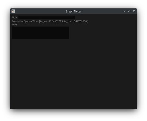
egui::TextEdit::multiline(&mut self.note.text).show(ui);Putting everything together, we should be able to launch the app and see… nothing different. On the backend, we’re now tracking (but not using) a note creation date and an always-empty title field. Let’s get those things onto the screen to work with:
    fn update(&mut self, ctx: &Context, frame: &mut Frame) {
        egui::CentralPanel::default().show(ctx, |ui| {
            ui.horizontal(|ui| {
                ui.label("Title");
                ui.text_edit_singleline(&mut self.note.title);
            });

            ui.label(format!("Created at {:?}", self.note.created_on));

            ui.label("Text");
            egui::TextEdit::multiline(&mut self.note.text).show(ui);
        });
    }
Aside from the most unreadable time format ever, we’re closer. Let’s solve that formatting issue by bringing in the time library:
$ cargo add time…and modify our format string to use the OffsetDateTime struct
instead of our SystemTime instance:
ui.label(format!("Created at {:?}", OffsetDateTime::from(self.note.created_on)));
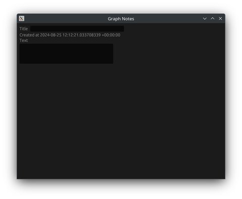
It’s a vast (albeit imperfect) improvement from before. There are more formatting opportunities in this time library,
and we can target those at a future time (pun intended), but these steps will lay some groundwork for those changes.
Memo to self
Storing as a SystemTime and continuously casting it to OffsetDateTime seems wasteful; we might make
this a target for future refactors…
Laying the groundwork for CRUD
Now that we have a rough shape for our data, let’s see about having a list of these guys. In a nutshell, we need to permit for a list of notes, along with the necessary CRUD operations and user interface to pull it off. To start, let’s convert our single note instance into a collection, and automatically spawn the first one on app launch - this will give us parity with our current workflow and allow us to iterate:
Re-running the app at this point, everything should continue to look and behave as it did previously. We do have a baked-in
assumption when displaying the note, though, that we are guaranteed to work with a note at index [0], which is a problem that
we can remedy by tracking which note is being displayed at a given time. For now, we’ll track this selection by index:
As with before, we should still have parity with our prior run.
Adding and listing notes
Let’s focus next on the UI for adding new notes. It’s going to start off rough, but I promise in the future that we’ll tidy up the UI to make it easier on the eyes. For today, the things I think we need to execute this idea include:
- A button that allows us to add a new note
- A list of existing notes displaying date and title
- Selection capability - picking one of our listed notes should make it the currently displayed note
Let’s tackle these items in the listed order. First, I’ll just plop the button down above our first ui.horizontal() call:
fn update(&mut self, ctx: &Context, frame: &mut Frame) {
    egui::CentralPanel::default().show(ctx, |ui| {
        if ui.button("Add new note").clicked() {
            self.notes.push(Note::new());
            self.selected_note = self.notes.len() - 1;
        }

        ui.horizontal(|ui| {
            ui.label("Title");
            ui.text_edit_singleline(&mut self.notes[self.selected_note].title);
        });

        // ...
    });
}
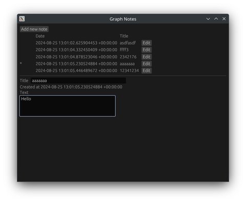
Were you to run in our current state, you’d see that clicking the button updates the displayed timestamp and clears out our inputs - or, rather, we’re displaying the newly-created note, but seemingly lose access to our prior notes in the process. It would be nice to know we’re not actually getting rid of our previous notes, so let’s tackle that list (and while we’re in there, the selection ability):
I threw in a ui.separator() call to give us some ability to distinguish between the elements of our app; without it,
things get a bit cramped and confusing. Not that it’s all that great now, but hopefully it makes some sense to look at:

There’s much room for improvement. Note the conditional * field to show us our current selection. The crazy date format.
Why do we display an “Edit” button on the same row as we have currently selected? Still, this gives us a starting point.
Removal of notes
Well, let’s wrap up our session today with the idea of note deletion. It introduces some concerns that we didn’t have before:
- If we’re on a selection, and the list above us shifts, we need to adjust our selection to stay with the current note
- If we’re on a selection and that index is removed, where do we end up? For now, let’s try to stay on the current index…
- …but if that selection was the last index, we should decrement to the last available index
- And, if we delete all of our notes, we shouldn’t display the note form at all
These rules are arbitrary, but give us some guard rails to keep the app from panicking when we inevitably point to a note that no longer exists.
Bad practice in action
The “Remove” button will live alongside the “Edit” button for corresponding records. In it, we’ll have to accommodate many of our above rules, which will make for a lot of business logic - this much commingled UI and logic will become a pain point in the future, and dealing with this will be a topic for another day.
You’ll see that I had to account for the to_remove and to_select variables - Rust forces us to avoid making changes
to that list of notes while we’re inside the loop that renders it, where other languages might happily ignore the potential
for trouble that such a thing creates. This will be a common pattern in list-based applications, so get used to seeing
this kind of code.
Also while we were at it, I gated the note entry form behind a mutable-get-by-index (self.notes.get_mut()) - this way,
we only edit a note if we have access to the one we’re referring to, and likewise we make the inside code more terse by
avoiding the deeper path reference to self.notes[self.selected_index].
Running now, you should see that we have the ability to add, edit, and delete notes with impunity.
In closing
Today, we saw how iterative steps in Rust can get us closer to our vision. It’s still hard on the eyes, and doesn’t even begin to do the things I’ve promised beyond what you can find in a basic notes app, but it should hopefully demonstrate the process we’ll be taking along the way to flesh out the ideal form for this thing.
All changes made in this article can be found in the relevant commit on GitHub.